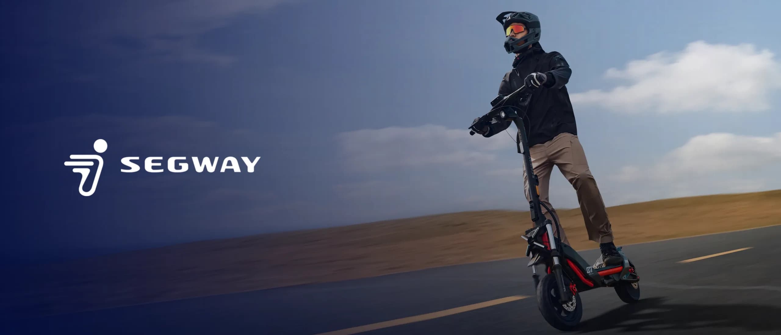
Segway Powersports
Corporate Website Development
Off-Road Vehicles
2023
A brand's visual strength comes from hundreds of designs speaking the same language, not from one good design.
Most brands don't have a bad-design problem; they have a scattered-design problem. The logo lives in one world, the deck in another, social media somewhere else entirely. So we start with rules rather than individual artefacts: which typography, which colour scale, which spacing logic, which visual tone.
Once the rules are settled, production speeds up. A catalogue and an Instagram post produced from the same system read as the same brand even when seen apart. That consistency makes a brand look larger than its media budget.
We hand over the guidelines alongside the files, so the system holds together when your own team or another agency picks it up.
A complete identity: logo, colour palette, typographic scale and usage rules.
Business cards, letterheads, catalogues, brochures and deck templates.
Social templates, ad creative and the visual language of the website.
A practical, example-led document that keeps the system intact.
We clarify what the brand wants to say and who it is saying it to.
We present two distinct visual directions and choose together.
The chosen direction becomes rules, applied across every medium.
Source files, exports and brand guidelines are transferred to you.
Corporate Website Development
Off-Road Vehicles
2023
Graphic Design
Food & Beverage
2026

Corporate Website Development
Aesthetic Clinic
2025